
Avenier / Field notesNº 003
Field note 003 / Print + advertising
Print Is Not Dead.Forgettable Print Is.
Physical communication still earns attention—when it actually deserves to.
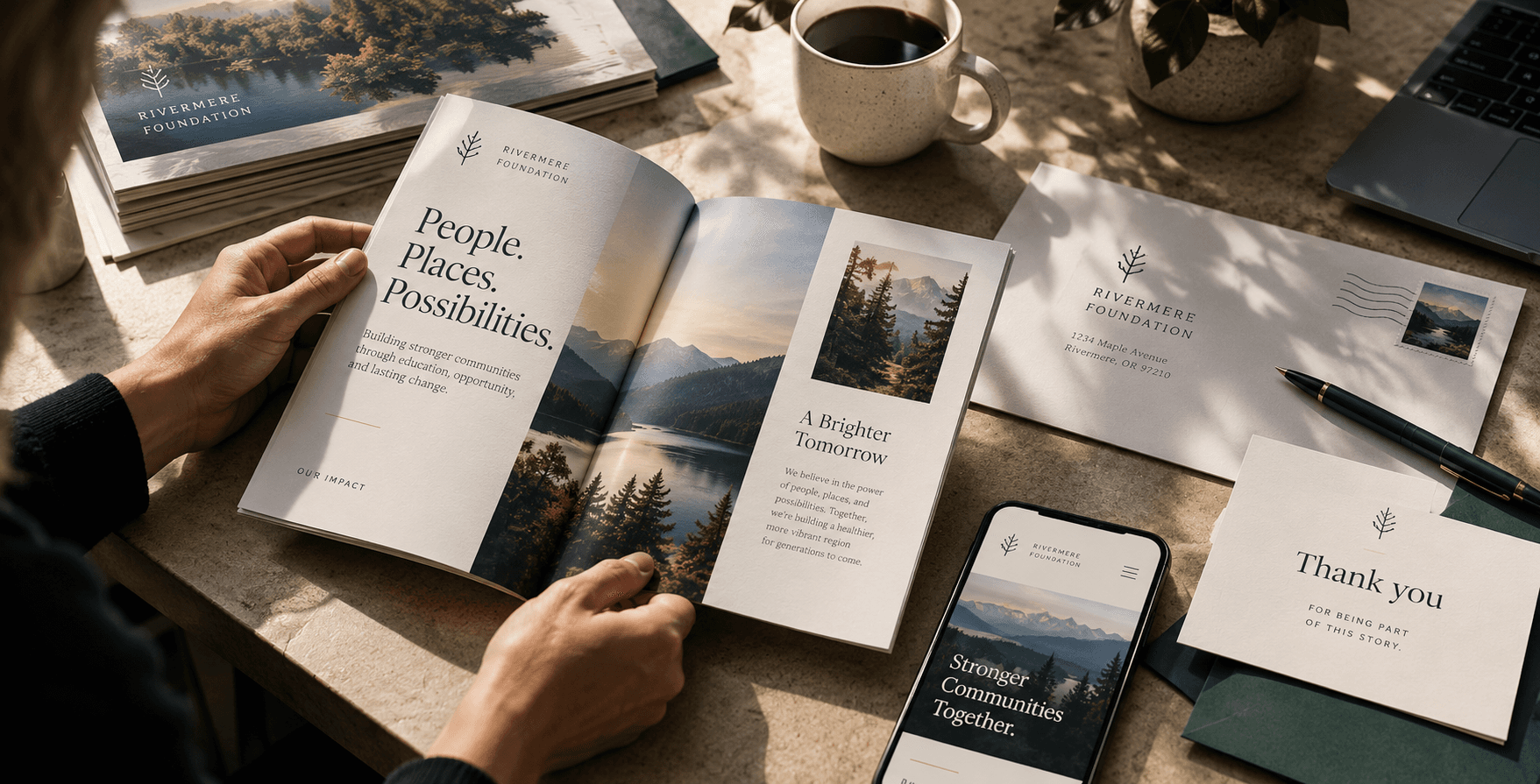
Print is often declared dead simply because so much of it deserves to be ignored. A crowded flyer, a disposable brochure, or a logo slapped onto another promotional item doesn’t become meaningful just because it exists in physical form. But when print is purposeful, tactile, and connected to a larger ecosystem, it can command a level of deliberate attention that digital communication rarely captures.
Generic, disconnected, disposable print has lost its value. A physical piece becomes genuinely powerful when it gives someone a compelling reason to keep it, act on it, or remember the organization behind it.
For leaders of small and midsize organizations, budgets are finite and attention is scarce. Every brochure, postcard, menu, appeal, or event piece either strengthens your presence or quietly adds to the noise people have learned to tune out.
Print Occupies Physical Space
A digital impression vanishes almost as quickly as it arrives. A notification is swiped away. A social feed refreshes. An email is archived before it’s even fully read.
Physical print behaves differently. A well-crafted brochure sits on a desk. A donor appeal remains propped beside a kitchen table. A menu stays in active circulation throughout an evening. A postcard hangs on a community bulletin board, or a reference card lives in a coat pocket until it's needed.
Physical presence alone, however, doesn't make communication effective. A piece that occupies space without offering clarity, usefulness, or genuine care simply becomes more clutter to manage.
The question isn’t whether print can remain present; it’s whether the piece actually justifies the physical space it asks for.
When it does, print keeps your message nearby long after a screen has changed. That staying power is one of the quiet, enduring advantages of physical communication—and one of the easiest to waste.
Attention Changes When Something Is Held
Holding a printed piece creates a completely different interaction than scrolling. Someone unfolds a panel, turns a heavy page, sets the piece down, picks it up again, or places it where it can be seen later. These small physical actions slow the entire encounter down, asking for a deeper, more deliberate kind of focus.
This isn't an argument that print always outperforms digital media. People routinely breeze past handouts and ignore racks of generic literature. The format only helps when the content and craftsmanship give someone a compelling reason to engage.
When format supports the message, print creates a quiet, intimate reading experience. A focused case-for-support booklet invites a donor to sit with a powerful story. A thoughtfully designed menu shapes the very atmosphere of a dining room. A carefully produced event piece becomes part of how an evening is remembered. The object actively participates in the communication rather than just carrying the text.
Printing More Doesn’t Mean Communicating Better
Organizations often respond to communication friction by producing more material: Another flyer. Another brochure. Another promotional item stamped with a logo. Volume can easily feel like progress when an event is approaching or a campaign is ramping up.
Volumeis not clarity.
An overcrowded flyer asks the eye to do too much work. A generic brochure tries to speak to everyone and ends up sounding like no one in particular. Disposable handouts disappear because they never earned a second look.
The underlying problem is usually strategic, not decorative. A piece without a defined audience has no clear reason to exist. A piece without a distinct next action leaves people impressed or indifferent, but entirely unguided. Producing an object is easy; designing meaningful communication requires deciding precisely what the piece is for.
The Material Is Part of the Message
Paper weight, texture, scale, fold, typography, color, finish, and production quality all influence how a piece is perceived and used. People instantly notice when something feels flimsy, cramped, or careless. They also notice when a piece feels considered—when the materials are chosen specifically for the job rather than added for superficial decoration.
This doesn't mean expensive materials are always better. A community handout, a donor appeal, a restaurant menu, and a municipal notice should never share the same production treatment.
Appropriateness always matters more than luxury:
- A heavy paper stock that makes a menu awkward to handle actively undermines the guest experience.
- An overly delicate finish on a frequently used municipal form makes the piece impractical.
- A public notice often needs clarity and durability far more than theatrical craft.
Material choices should reinforce your purpose. They should make it easier for someone to read, keep, share, display, or act. When production decisions are made just to make a piece feel expensive, the result feels forced. When they are made to support how the piece will actually be used, the object starts communicating before a single sentence is read.
Print Works Best as Part of a System
Print is rarely the entire conversation. Its greatest strength lies in how it begins, deepens, or continues a journey that also includes digital touchpoints.
- A donor appeal can create a focused emotional encounter on paper and then lead directly into a streamlined online giving experience.
- A restaurant menu reinforces the immediate atmosphere while connecting guests to reservations or online ordering.
- A postcard can introduce a regional campaign that continues online with richer detail and video.
- A municipal notice can guide residents toward a frictionless digital service without forcing them to guess who to call.
- Donor appealFocused storyOnline giving
- MenuDining experienceReservation / ordering
- PostcardInitial awarenessDeeper campaign content
- Public noticeEssential informationDigital service
The goal is never to make print imitate a website, nor is it to let a website erase the unique value of a physical encounter. The goal is to give each medium the specific work it does best: print earns the initial attention and creates a tangible moment; digital tools extend it by providing depth, convenience, and ongoing access.
The Test: Is It Worth Keeping?
Before an organization commits to a print run, it needs a practical standard. Not every piece has to become a permanent family heirloom, but every piece should be intentional enough that someone immediately understands why it was made.
Before printing your next project, run it through these seven questions:
A practical field note
Is itworth keeping?
Seven questions to ask before the next print run.
- Who is this specifically for?
- What should they understand or feel?
- What is the single most important action they should take?
- Why does this specific piece need to be physical?
- Will the format help someone use, keep, or remember it?
- Does it connect naturally to the next touchpoint in the journey?
- Would we keep this ourselves if we received it?
"Worth keeping" isn't a demand for permanent storage. It's a standard for usefulness, care, relevance, and intentionality. Some pieces are designed to be used once and recycled. Others are meant to stay nearby for weeks or months.
Ultimately, the test is whether the piece respects the person holding it—and whether your organization would proudly stand behind it if your own name were on the receiving end.
The next question
Is your printworth keeping?
Give people a reasonto hold onto it.
Avenier helps organizations create physical communications that are purposeful, useful, and connected to the larger experience around them.